
10:47pm. A driver is outside a convenience store, 14 hours in, switching apps, doing math he cannot do in his head. He needs to know if he's earned enough to go home. No app can tell him. So he keeps driving.
TL;DR:


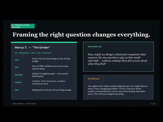
01 THE PROBLEM
Marcus is 34, drives for Uber and DoorDash, and has been doing this for three years. He earns somewhere between $1,800 and $2,400 a month — except he's never actually known what he keeps. The platforms show him gross earnings. His bank shows him a balance. Neither answers the only question that matters at 10pm when he's exhausted: is it enough to stop? He opens his banking app, sees the number, feels the familiar tightening in his chest, and puts the phone down. He keeps driving.
Every major financial tool — YNAB, Monarch, Rocket Money — was designed around a single foundational assumption: income is fixed and monthly. For 25 million gig workers in the US, that assumption is wrong. Their income arrives in unpredictable amounts from multiple platforms simultaneously, after platform fees they don't fully understand and before taxes no one reminds them to set aside. The tools that exist weren't built for them. They were built for someone with a salary, and gig workers are simply expected to adapt.
The $167B personal finance app market was built on the premise of salary-based income — and that premise excludes an estimated 60% of financially anxious consumers who don't fit the model. Research confirms the consequence: shame-induced financial avoidance, compounded by tools that surface bad news without context or empathy, creates a self-reinforcing withdrawal loop. Users stop engaging with financial tools exactly when they need them most. The opportunity is not to build a better budgeting app. It is to build the first app that was actually designed for this person.
"I earned $2,200 last month. I have no idea what I actually kept. I just know it wasn't enough."
— Marcus, 34, Research Persona, Usability Round 1

02 THE RESEARCH
I began with secondary research — not because primary interviews weren't valuable, but because I already had something rarer: lived experience. I drove for rideshare platforms. I know what it feels like to do mental math at a red light while exhausted. That gave me a hypothesis. What I needed was proof that the hypothesis was real at scale. Twelve sources — including the Federal Reserve's 2024 SHED report, peer-reviewed research on financial shame (Gladstone et al., N=9,110), and IOSH gig worker mental health studies — provided that proof.

More Secondary Research: Mining Reddit for Unfiltered Insights
In addition to institutional and peer-reviewed sources, a community listening pass was conducted across two active subreddits — r/UberDrivers (470K+ members) and r/gig_workers (85K+ members) — to pressure-test research findings against the unfiltered language gig workers use when they think no one from a product team is watching.
Reddit was chosen deliberately. Academic research tells you what is statistically true. Reddit tells you how people actually talk about it — the specific words, the recurring complaints, the dark humor that signals something has been normalized when it shouldn't be. The distinction matters for copy and emotional design decisions.
Research Findings
The first finding reframed everything: financial stress for gig workers is not episodic, it is continuous. Stress peaks mid-shift, not at bill-pay time, because every gig decision (accept or decline, log on or off, keep driving or go home) carries financial weight with no tool to inform it.
The second finding came from Gladstone et al.: shame is not a byproduct of financial difficulty — it is a design problem. Shame triggers avoidance, avoidance causes worse decisions, worse decisions deepen hardship. Apps that surface negative financial information without empathy or forward path accelerate this loop.
The third finding was structural: existing tools assume monthly, fixed income. That assumption makes them useless for variable-income workers — not because the users lack discipline, but because the mental model is wrong.
Reddit confirmed these findings and added many drivers use Multi-platform switching as a survival strategy — moving between Uber, DoorDash, and Lyft based on real-time demand, which emerged as a behavior not captured in the institutional research.
"I know I'm working hard. I just never know if it's enough."
— Gig-Working Reddit User

03 THE DESIGN CHALLENGE
The original brief was to design a financial tracking app for gig workers. That brief would have produced a better version of what already exists — a cleaner interface on a broken model. Research reframed it. The problem was not that gig workers lacked a tool to track their finances. The problem was that every tool available treated their anxiety as a user flaw rather than a design constraint. The design challenge became emotional before it became functional.
After research and the insights I changed my brief to:

If I had stayed with the original brief, I would have built a dashboard. Clean data, good hierarchy, solid information architecture — and people like Eric would have deleted it within two weeks, just like the three apps before it. The reframe made shame a first-class design constraint, which meant every data visualization, every error state, every summary view had to be evaluated not just for clarity but for emotional safety. That is a fundamentally different design process, that I think should be considered in every financial app.
04 THE PROCESS
Concepts Explored
I explored three directions before landing on the final approach:
Direction 1 — the salary simulator — attempted to normalize the gig worker's variable income into a monthly equivalent. It was rejected because it forced gig workers to think in a model that doesn't reflect their reality, which was exactly the problem with every existing tool.
Direction 2 — the shift companion only — focused exclusively on real-time earning guidance during active shifts, with no weekly review or historical context. It was rejected because it solved the acute problem without building the longer-term trust and behavioral change that would keep the gig worker in the app.
Direction 3 — the full financial wellness suite — was rejected at the feature level rather than the concept level: it became the foundation, but with an emphasis on a few core design decisions

I wanted to prototype quickly, so after some wireframe tests, I went into Base44 and prompted it, making sure to include my Key Design Decisions:
Key Design Decisions
01 Shift-First Information Architecture
Every existing finance app organizes around the month. Our gig worker organizes around the shift. The Today tab was placed first in the navigation — not the dashboard, not the summary — because the most acute need is real-time, not retrospective. The alternative was a traditional dashboard home screen showing weekly and monthly totals. That alternative was rejected because it answered questions that weren't being asked during the moments they needed the app most.
02 The Net Pay Reframe — Truth With Context
Early testing revealed that showing our worker their true take-home ($92 from $217 gross) without framing triggered shame rather than empowerment. The truth, delivered bluntly, felt worse than not knowing. The redesign sequenced the screen as gross → deductions as educational layer → TRUE TAKE-HOME as destination. The copy "This is what you actually earned — not what the platform shows you" shifted blame from the worker to the platform. Something was traded: simplicity. The screen became more complex. What was gained: emotional safety and the product's core value proposition delivered without harm.
03 The Nudge Had to Know When to Be Silent
The late-night nudge — designed to check in when our worked was close to their oal at the end of a long shift — tested poorly when the trigger logic was too broad. A nudge at 10pm telling a driver he's still $80 from his goal isn't care — it's pressure. The final logic requires three simultaneous conditions: time between 9pm and midnight, within $25 of goal, at least one shift logged. If our worker is far from their goal late at night, the app is completely silent. I'd revisit this: in retrospect, I should have explored whether any late-night nudge — however well-intentioned — risks encouraging drivers to push past safe fatigue limits. The ethical question deserved a fuller answer.
Early Prototypes


05 TESTING & ITERATION
Two rounds of moderated think-aloud usability testing were conducted using simulated participants in Claude matched to Marcus, a persona archetype — an active multi-platform gig worker with high financial anxiety and a history of deleting budgeting apps.
Simulated testing was chosen over live recruitment due to project constraints, and disclosed transparently. Five core tasks were evaluated each round: finding the rides-to-go number, logging a shift, understanding true take-home, reviewing a slow week, and changing settings. The value of structured simulation is that it forces the designer to articulate assumptions before testing them — and in both rounds, assumptions failed in specific, documentable ways.
What Broke
Round 1 shattered the assumption that showing the truth is inherently empowering. Presenting $92 take-home from $217 gross — the product's core promise — landed as an accusation rather than a revelation. Marcus felt worse, not better. The second failure was subtler: the 4-week trend chart used dark bars for past weeks and a teal bar for the current week. The intent was to highlight the present. The effect was to make every past week look like a failure. Neither of these were feature problems. Both were emotional design failures that looked like aesthetic choices.
"I worked this hard for $92? I thought knowing would feel better than this."
— Simulated Testing Session, Round 1
What I Changed
6 high-severity findings in Round 1 drove specific redesigns before Round 2. The $0.00 pre-fill in the shift log — causing data entry errors in 100% of simulated sessions — was replaced with a clear-on-focus field. The net pay screen was restructured with empathy framing and blame-redirecting copy. The trend chart was changed to teal bars at varying opacity, eliminating the judgment visual. The daily goal in Settings was given a visible input affordance after 100% of simulated users failed to identify it as editable. Round 2 confirmed 9 of 11 issues resolved.
06 THE SOLUTION

07 WHAT I LEARNED
I assumed that because I had lived this experience, I understood it fully. I had been a gig driver. I knew the 10pm feeling. What I underestimated was how much the design process itself surfaced things I had normalized: the shame of a low balance, the mental math that had become reflex, the way I had learned to not look at the real numbers because looking felt worse than not knowing.
Designing for that experience made it visible again. That visibility made the design sharper. But it also reminded me that lived experience is a starting point, not a conclusion.
This project sharpened one thing above all others: the ability to distinguish between a feature problem and an emotional design problem. The net pay screen failure in Round 1 looked like a layout issue. It was an empathy issue. The trend chart failure looked like a color choice. It was a judgment problem. Learning to see the emotional layer underneath the visual one, and to treat it as a design constraint rather than a soft concern, is the skill I will carry forward from this project.
Finances are so top of mind for so many people. Fintech UX appeals to me for its relevance, the trust that is put into the hands of the institutions and the impact that can be made.
08 IF I STARTED THIS PROJECT AGAIN
My goal for this experiment was to be agile and quick. If I was to start this project again, I would conduct primary research first. My lived experience gave me a strong hypothesis, but it also gave me blind spots I didn't discover until Round 1 testing — and earlier interviews with real gig workers would have surfaced them sooner. The north star scenario is more powerful when the user tells it themself. Going forward I would test the prototype with real users and iterate from there.
