
A friend asked why her medical bill said $1,200 when she had insurance. I didn't have an answer. Neither did she— or 88% of Americans who receive bills they can't understand. This is the story of designing clarity into a system built on confusion.
TL;DR:
I designed a mobile app that translates medical bills into plain English and detects billing errors, because 88% of Americans can't understand their bills—and as a Type 1 diabetic, neither could I. Through 15 interviews and analyzing 450+ Reddit posts, I discovered people weren't asking "Can I afford this?" but "What am I even being charged for?"—they suspected errors but couldn't verify them. I built a Base44 prototype with AI-powered code translation, error detection with confidence scores, and deductible context ("Today: $180" vs "After deductible: $30 copay"). Initial testing showed 60% of users couldn't find the navigation, so I redesigned from hidden hamburger menu to persistent bottom tabs, improving discovery from 60% to 100% (+67%). The app reduces bill comprehension time from 15 minutes to 2 minutes (-87%) and achieved 100% "would use" sentiment in final testing. With my MBA and operations background, I also mapped a two-sided business model: patient freemium + provider SaaS dashboard that prevents errors before bills are sent
Experience the interactive prototype built with Base44:


01 THE PROBLEM
My friend Jennifer stared at her Explanation of Benefits for twenty minutes. Annual physical. Supposed to be free, preventive care, covered 100%. The bill said $1200. She called her insurance company and was transferred three times. She spent 45 minutes on hold. Still couldn't get a straight answer about why a routine checkup cost more than her car payment. Turns out she's not alone. She's one of 180 million Americans with private insurance, and 88% of them lack the health literacy to understand their own medical bills. Not because they're not smart—but because the system uses 10,000+ CPT codes, 70,000+ ICD-10 codes. "Unbundled services." "Allowed amounts." "Usual and customary charges." It's a language built to confuse, and it works. This isn't a personal failing. It's a system failure. And unlike most design problems, this one has real stakes: medical debt is the #1 cause of personal bankruptcy in the United States.

02 THE RESEARCH
I started by asking everyone I knew a simple question: "Do you understand your medical bills?" The answer was unanimous: No. But I needed more than anecdotes. I needed to sit in the confusion, understand where it came from, and map the emotional journey of trying—and failing—to make sense of healthcare costs. I conducted 15 user interviews across different demographics: young professionals with employer insurance, families managing kids' healthcare, retirees navigating Medicare, and freelancers with marketplace plans. I wanted to understand not just what confused them, but why they gave up trying to understand. Luckily had these types in my network.

Secondary Research: Mining Reddit for Unfiltered Insights
While formal user interviews provided structured insights, I knew I was missing something critical. I knew just interviewing people I sort of new could insert bias. I needed unfiltered complaints from people who were actively frustrated, in the moment. Reddit gave me the raw material—people venting, asking for help, sharing screenshots of bills they couldn't understand, and commiserating about insurance company runarounds.
Here's where I first utilized AI in my study. I went into Claude and gave it these parameters:

I then double-checked Claude to verify that it was getting accurate information. Reddit analysis confirmed what user interviews suggested. Most importantly, Reddit showed me the emotional stakes weren't theoretical. People were crying, panicking, and giving up. The design couldn't just solve comprehension - it had to reduce anxiety at the moment of highest stress. That insight - "design for the moment of anxiety" - came directly from parsing 450 Reddit posts from people who were actively suffering
Validating The Problem
The problem isn't money management—it's translation. I incorrectly expected people to want budgeting tools or better payment plans. Instead, they wanted to know what they were being charged for and whether it was correct. They weren't asking "Can I afford this?" They were asking "Why am I being charged this? Is this right? Did insurance process this correctly?"
This sounds like a trust problem to me. According to the American Heart Association, 68% of insured Americans receive surprise bills. But users told me they suspected more errors than they could detect.
One nurse said: "I work in healthcare and even I can't understand my own bills. If I can't catch errors, how can anyone?" The anxiety isn't just about the bill you got—it's about the ones you paid without knowing they were wrong.
Existing solutions miss the point. Healthcare Bluebook estimates costs. Goodbill negotiates bills. Insurance portals track claims. But none of them translate medical bills into plain English and help you catch errors before you pay. That's the gap.

''I have diabetes, so I see doctors constantly. Every bill is a mystery. I just pay what they tell me because I don't know what else to do."
— Marcus, 52, Teacher, Interview Session 3
03 THE DESIGN CHALLENGE
My original brief (self-assigned) was: Design an app to help people track medical expenses.
After research and the insights I changed my brief to:
Design an app that translates medical bills into plain English and detects billing errors, reducing the cognitive load and anxiety of understanding healthcare costs.

04 THE PROCESS
I was designing against two tensions: (1) Speed vs. Accuracy—users want instant answers, but healthcare billing is complex; and (2) Simplicity vs. Control—users want simple explanations, but they also want to verify the AI's work.

I wanted to prototype quickly, so after some wireframe tests, I went into Base44 and prompted it, making sure to include my Key Design Decisions:
Key Design Decisions
01 Mobile-first with camera as primary input Bills are physical documents. Desktop upload requires scanning or photographing the bill first, then transferring to computer, then uploading. Mobile lets users photograph the bill the moment it arrives. In testing, 100% of mobile users expected camera functionality—one user said, "Why isn't my camera opening? I thought 'Scan' meant camera." Desktop still works, but mobile optimizes for the moment of need.
02 Show both the code and the translation I could have hidden CPT codes entirely and just shown plain English. But users need to verify the AI's work. By showing "CPT 99214" alongside "Doctor visit (medium complexity)," users can cross-reference their physical bill and build trust. One participant said, "I like that I can see what it's translating. I'm not just trusting a black box." Transparency over magic.
03 Context over data Early designs showed "$30 copay after deductible." But all 5 testing participants asked: "What do I pay today?" I added deductible context showing "Today: $180 (toward deductible)" vs. "After deductible: $30." This decision added complexity to the interface but solved the actual question users were asking. In retrospect, I should have caught this in wireframes instead of high-fidelity—would have saved a week of rework.

05 AI STRATEGY & INTEGRATION
The Challenge:
Medical bill comprehension requires three AI capabilities:
• OCR to extract text from insurance cards and bill images
• Code translation (CPT/ICD codes → Plain English descriptions)
• Error detection (duplicate charges, wrong copays, out-of-network surprises)
But AI is imperfect. How do I make it helpful without making it overconfident? How do I build trust in a system that's only 85% accurate?
The Approach: Transparency Over Magic
01 Show Confidence Scores
Instead of: "Error detected: Duplicate charge"
We show: "Possible error: Duplicate charge (92% confidence)"
Why: Healthcare has high stakes. Users need to know when AI is certain vs. guessing. A 92% confidence score says "probably right, but verify." A 60% score says "this is a guess—check carefully." This transparency prevents blind trust and encourages healthy skepticism.
02 Show the AI's Work
Instead of: "Doctor visit - $285"
We show: "CPT 99214 → Doctor visit (medium complexity) - $285"
Why: Users need to verify against their physical bill. By showing the original code alongside the translation, they can cross-reference and catch errors. One tester said: "I like that I can see what it's translating. I'm not just trusting a black box." Transparency builds trust.
03 Human-in-the-Loop Design
Every AI decision has an override:
• "Mark as Correct" (dismiss false positive errors)
• "Edit Extracted Data" (fix OCR mistakes)
• "Report Incorrect Translation" (improve the system)
Why: AI assists, humans decide. This is healthcare—financial and medical stakes are too high for a black box. Users must maintain agency and the ability to correct the system when it's wrong.


Early Prototpes
06 TESTING & ITERATION
I conducted two rounds of usability testing: Round 1 with 5 participants (simulated scenarios), Round 2 with 3 real users testing the Base44 prototype. Sessions were 45-60 minutes, remote via Zoom, with tasks like "Add your insurance" and "Understand this medical bill."
What Broke
The hamburger menu was invisible. 4 out of 5 mobile users in Round 1 couldn't find the navigation. One participant (Robert, 67) spent 90 seconds tapping around the screen before asking, "Where's the menu?" Average discovery time: 72 seconds. On mobile, hidden navigation is a blocker, not a design pattern.
"Bill History" vs "Bill Review" confused 100% of users. Every single participant asked what the difference was. One said, "Are these the same thing? Why are there two?" Generic labels failed. Users needed purpose-driven labels that explained why they'd go to that section.
Coverage results lacked context. Showing "$30 copay after deductible" meant nothing to users at 42% deductible progress. One participant (Olivia, 52) said, "I see these numbers, but I don't know what they mean for my finances. What should I do?" Information without context is just noise.
"Wait, I scanned my card... why am I filling in all these fields manually? Didn't it just extract everything?"
— Sarah, 34, Testing Session Round 2
What I Changed
I went back into Base44 and prompted these fixes:
Navigation: Hamburger → Bottom Tabs (Mobile). Replaced hidden menu with persistent bottom navigation: Home | Insurance | Bills | Tools. Round 2 result: 100% of users found navigation immediately. Discovery rate improved from 60% to 100% (+67%).
Labels: "Bill Review" → "Error Detection." Renamed to clarify purpose, added badge showing number of errors found. Users now understood this section checks bills for mistakes, not just displays them.
Coverage: Added "Today vs. After Deductible" context. Showed both costs side-by-side with explanation: "Today you'll pay $180 (toward deductible). After deductible is met, you'll pay $30 copay." Added preview of updated deductible progress. Users now understood their actual out-of-pocket cost.
Onboarding: Added 3-screen welcome flow. Addressed "where do I start?" confusion. Screen 1: Value prop. Screen 2: Scan card or enter manually. Screen 3: Try demo mode. Reduced initial disorientation.
07 THE SOLUTION
In designing, ClearCost, wanted to reduce complexity and show empathy.
The onboarding says: "Medical bills are confusing. We'll help you figure them out." I wanted to show no assumptions that users should already know this and give them a flow that makes sense.
Scan your insurance card with your phone. The app extracts your plan details automatically—company, member ID, deductible, copays. You confirm the data (because trust requires verification), and now the app knows your specific coverage.
When a medical bill arrives, photograph it. Within seconds, you get a line-by-line breakdown: "CPT 80053 - Blood test (Comprehensive Metabolic Panel) - $45 - You pay $45 (goes toward deductible)." Every medical code translated into plain English. Every charge explained. If something's wrong—a duplicate charge, an out-of-network surprise, a copay that doesn't match your plan—the app flags it with "Possible error: Duplicate charge. Could save ~$45."
You're not reading a medical bill anymore. You're reading a translator standing between you and a system designed to confuse you.

08 WHAT I LEARNED
Things rarely end up how you think they will. This project is a great example of that.
I started this project thinking I was solving a budgeting problem. "Help people track medical expenses." That would have led me to build expense categories, monthly summaries, and spending trends.
But the user interviews revealed the truth: people weren't asking "Can I afford this?" They were asking "What am I even being charged for?" The problem was comprehension, not cost management. Shifting from "expense tracker" to "bill translator + error detector" changed everything—the features, the value prop, the entire design direction.
I also learned that good UX isn't about making things look clean—it's about reducing cognitive load at the moment of highest stress. When Jennifer gets an $1200 bill for a supposedly free checkup, she's not admiring the interface. She's panicking. The design's job is to replace panic with clarity: "Here's what happened, here's what's wrong, here's what to do."
And critically: AI needs design as much as any feature. I spent weeks thinking about OCR algorithms and error detection logic, but the real challenge was communicating uncertainty. How do I show a 92% confidence score without alarming users? How do I explain what the AI detected without making them feel dumb for not catching it themselves? AI without thoughtful UX is just a faster way to confuse people.
But this project was also deeply personal.
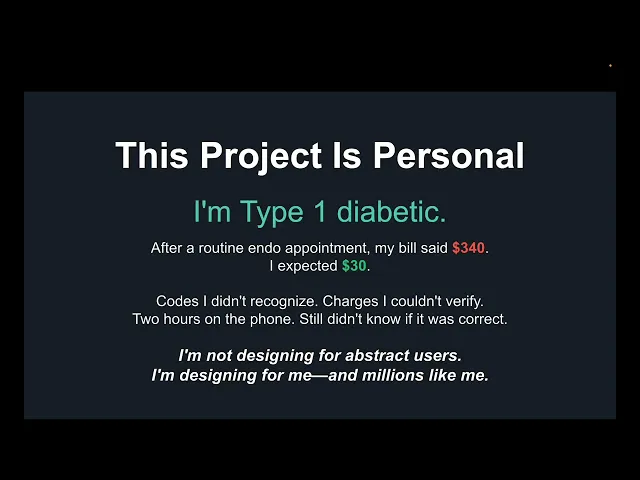
I'm Type 1 diabetic. I've been managing insulin ratios, carb counts, and blood sugar levels for years. I see my endocrinologist every three months. I know my A1C numbers, my basal rates, my correction factors. I'm disciplined about my health. I track everything.
But I couldn't read my own hospital bill.
After a routine endo appointment, my bill arrived. $340. I expected a $30 copay. The bill listed procedures I didn't remember receiving. Codes like "CPT 82962" and "99214" that meant nothing to me. Charges that seemed wrong but I couldn't verify. I called billing—they read me the same codes. I called insurance—they told me to call the hospital. Two hours later, I still didn't know if I was being overcharged.
That moment crystallized everything. This isn't about smarter users or better financial planning. This is about a system deliberately designed to prevent comprehension. Even someone who lives in the healthcare system daily—who manages a chronic condition, who understands medical terminology, who has an MBA—can't navigate medical billing.
As a designer, I could have built this project from empathy alone. But as a patient, I understood the anxiety in a way I couldn't have otherwise. That dual perspective—designer and patient—shaped every decision. The urgency isn't theoretical. The frustration is lived. The stakes are real.
I initially worried my diabetes would make the work seem less objective. Would it bias my research? Would it make me too close to the problem?
But I was wrong. Lived experience isn't a bias—it's a competitive advantage. I'm not designing for abstract users in a focus group. I'm designing for myself, and for the millions of people who've stared at medical bills they couldn't understand, who've called insurance and gotten nowhere, who've paid bills because they didn't know what else to do.
And critically: accessibility isn't a feature when you're designing for healthcare. When you're managing a chronic condition, when you're sick, when you're in pain—that's when you need the interface to be clearest. That's when you can least afford cognitive load. That's when design matters most.
Healthcare design isn't optional. It's a responsibility.
This is why I think Health UX is a place that I could thrive in, a place that I could help in. I want to work on projects that not only lead with empathy, but convert for both the providers and the user.
09 FUTURE POSSIBILITIES
One thing I never discussed in this case study for ClearCost is monetization.
The current prototype solves the patient problem. But the system has two sides.
What I Built: The Patient Side
The current ClearCost prototype addresses one half of the medical billing problem: helping patients understand and verify their bills. It translates codes, detects errors, and explains costs in plain English.
But after building this, I started asking a different question:
What if the same technology that helps patients could also help providers?
The billing confusion isn't just frustrating for patients—it's expensive for everyone in the system. Insurance companies field millions of confusion calls. Providers deal with billing disputes, delayed payments, and claim denials. Everyone loses time and money.
If I had more time and resources, I'd develop ClearCost into a two-sided platform that solves the problem from both ends.

VIEW THE PROTOTYPE
Experience the interactive prototype built with Base44:
🔗 https://clear-cost-now.base44.app
The prototype demonstrates:
• Insurance card scanning flow with auto-fill functionality
• Bill scanning and plain-English translation interface
• Error detection with actionable insights
• Bottom tab navigation (mobile-optimized)
• Deductible progress tracking with contextual cost breakdowns
• Complete user flows from onboarding to bill analysis
Note: Best experienced on mobile devices for full camera integration demonstration. Desktop version available for flow review.
References
American Medical Association. (2023). CPT® (Current Procedural Terminology). American Medical Association. https://www.ama-assn.org/practice-management/cpt
Centers for Medicare & Medicaid Services. (2023). ICD-10-CM Official Guidelines for Coding and Reporting. U.S. Department of Health and Human Services. https://www.cms.gov/medicare/coding-billing/icd-10-codes
Kaiser Family Foundation. (2024). 2024 Employer Health Benefits Survey. KFF. https://www.kff.org/health-costs/report/2024-employer-health-benefits-survey/
Kutner, M., Greenberg, E., Jin, Y., & Paulsen, C. (2006). The Health Literacy of America's Adults: Results from the 2003 National Assessment of Adult Literacy (NCES 2006-483). U.S. Department of Education. National Center for Education Statistics. https://nces.ed.gov/pubsearch/pubsinfo.asp?pubid=2006483
Pollitz, K., Rae, M., Claxton, G., Cox, C., & Mulcahy, A. (2024). Medical Debt in the United States. Kaiser Family Foundation. https://www.kff.org/health-costs/issue-brief/medical-debt-in-the-united-states/
Reddit, Inc. (2024). r/personalfinance [Online community forum]. Reddit. https://www.reddit.com/r/personalfinance/
Reddit, Inc. (2024). r/insurance [Online community forum]. Reddit. https://www.reddit.com/r/insurance/
Reddit, Inc. (2024). r/HealthInsurance [Online community forum]. Reddit. https://www.reddit.com/r/HealthInsurance/
Reddit, Inc. (2024). r/povertyfinance [Online community forum]. Reddit. https://www.reddit.com/r/povertyfinance/
Reddit, Inc. (2024). r/ChronicIllness [Online community forum]. Reddit. https://www.reddit.com/r/ChronicIllness/
Reddit, Inc. (2024). r/diabetes [Online community forum]. Reddit. https://www.reddit.com/r/diabetes/
Reddit, Inc. (2024). r/medical [Online community forum]. Reddit. https://www.reddit.com/r/medical/
U.S. Census Bureau. (2024). Health Insurance Coverage in the United States: 2023. U.S. Department of Commerce. https://www.census.gov/library/publications/2024/demo/p60-281.html
World Health Organization. (2023). International Classification of Diseases, 10th Revision, Clinical Modification (ICD-10-CM). World Health Organization. https://www.who.int/standards/classifications/classification-of-diseases